3.5.3.3. Advanced Page
This page provides various options related to the drawing and the control for the force display on the animation state on the Working Window.
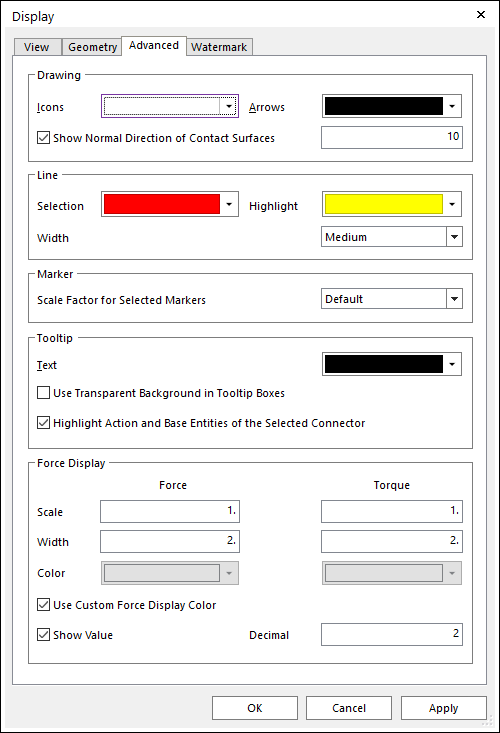
Figure 3.72 Display dialog box [Advanced]
Drawing
Icons: Selects the icon color on Working Window. In addition, the gravity icon color is set by this option.
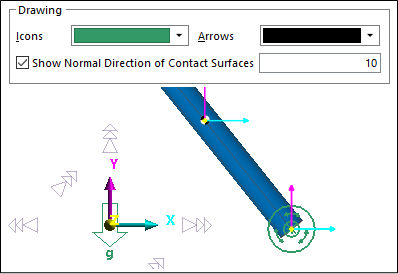
Figure 3.73 Changing the icons’ color
Arrows: Selects the allowed color which is applied for the Normal Direction color of the contact elements.
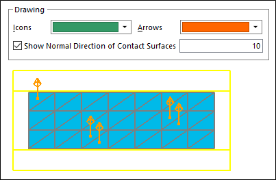
Figure 3.74 Changing the color of the arrows
Show Normal Direction of Contact Surfaces
If this option is checked, it shows the arrow icon which indicates the normal direction of the contact surface while the Contact property page is opened. (The default is checked, and the number of arrows is 10.)
The user can change the limitation of the maximum number of arrow icons.
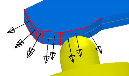
Figure 3.75 Arrow icons as 10
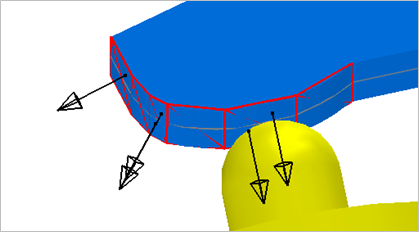
Figure 3.76 Arrow icons as 5
In the specific case of an FFlex body, the other Up/Down direction can display as the red arrow which is an additional one beyond the user-defined number because of the incorrect node sequence of an element.
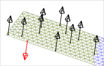
Figure 3.77 Displaying the other Up/Down direction
Line
Selection: Sets the color of selected entities in Working Window.
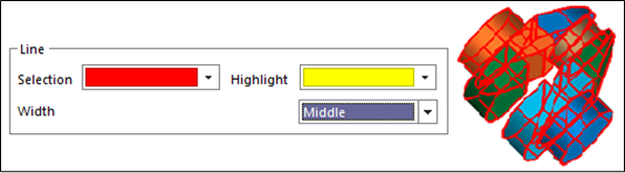
Figure 3.78 Selected entity’s color
Highlight: Sets the highlight color of selected entities when creating an entity in Working Window.
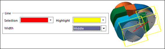
Figure 3.79 Highlight the entity’s color
Width: Sets the highlight line width of selected entities in Working Window.
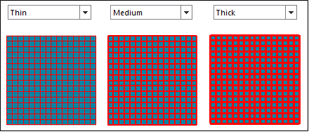
Figure 3.80 Line’s Width
Marker
Scale Factor for Selected Markers: Sets the scale factor for selected markers in Working Window.
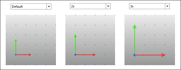
Figure 3.81 The scale factor for a selected marker
Tooltip
Text: Selects the text color of tooltip on the Working Window.
Use Transparent Background in Tooltip Boxes
If this option is checked, the background of the tooltip box becomes transparent.
If this option is not checked, the background of the tooltip shows as the white color. (The default option is unchecked.)
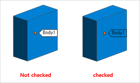
Figure 3.82 Background of the tooltip box
Force Display: Defines the properties of Force display during playing an animation. This function also is supported in Force Display Setting in the Animation Control group of the Analysis tab. It is useful for the user to change the values easily during playing an animation.
Scale: Sets the scale in the Force/Torque display.
Width: Sets the width (in pixels) of the line segments used in the Force/Torque display.
Color: Changes the color in the Force/Torque display.
Use Custom Force Display Color: If this option is checked, the user can set the color of Force/Torque for each entity individually.
Show Value: If this option is checked, the value of force or torque is displayed with an arrow.
Tip
If the user changes the Display Font Size in View tab of Display dialog, the size of Force/Torque value is changed.
Decimal: Decimal of displayed value of force or torque.
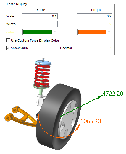
Figure 3.83 Example of Force/Torque Display